# TextInputLayout
TextInputLayout was introduced to display the floating label on EditText. The EditText has to be wrapped by TextInputLayout in order to display the floating label.
# Password Visibility Toggles
With an input password type, you can also enable an icon that can show or hide (opens new window) the entire text using the passwordToggleEnabled (opens new window) attribute.
You can also customize same default using these attributes:
passwordToggleDrawable(opens new window): to change the default eye iconpasswordToggleTint(opens new window): to apply a tint to the password visibility toggle drawable.passwordToggleTintMode(opens new window): to specify the blending mode used to apply the background tint.
Example:
<android.support.design.widget.TextInputLayout
        android:layout_width="match_parent"
        android:layout_height="wrap_content"
        app:passwordToggleContentDescription="@string/description"
        app:passwordToggleDrawable="@drawable/another_toggle_drawable"
        app:passwordToggleEnabled="true">

            <EditText/>

</android.support.design.widget.TextInputLayout>
# Adding Character Counting
The TextInputLayout has a character counter (opens new window) for an EditText defined within it.
The counter will be rendered below the EditText.
Just use the setCounterEnabled() (opens new window) and setCounterMaxLength (opens new window) methods:
TextInputLayout til = (TextInputLayout) findViewById(R.id.username);
til.setCounterEnabled(true);
til.setCounterMaxLength(15);
or the app:counterEnabled (opens new window) and app:counterMaxLength (opens new window) attributes in the xml.
<android.support.design.widget.TextInputLayout
    app:counterEnabled="true"
    app:counterMaxLength="15">

    <EditText/>

</android.support.design.widget.TextInputLayout>
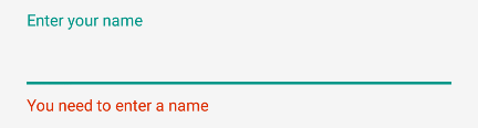
# Handling Errors
You can use the TextInputLayout to display error messages according to the material design guidelines (opens new window) using the setError (opens new window) and setErrorEnabled (opens new window)methods.
In order to show the error below the EditText use:
TextInputLayout til = (TextInputLayout) findViewById(R.id.username);
til.setErrorEnabled(true);
til.setError("You need to enter a name");
To enable error in the TextInputLayout you can eithr use app:errorEnabled="true" in xml or til.setErrorEnabled(true); as shown above.
You will obtain:
# Basic usage
It is the basic usage of the TextInputLayout.
Make sure to add the dependency in the build.gradle file as described in the remarks section.
Example:
<android.support.design.widget.TextInputLayout
         android:layout_width="match_parent"
         android:layout_height="wrap_content">

     <EditText
             android:layout_width="match_parent"
             android:layout_height="wrap_content"
             android:hint="@string/username"/>

 </android.support.design.widget.TextInputLayout>
# TextInputEditText
The TextInputEditText (opens new window) is an EditText with an extra fix to display a hint in the IME when in 'extract' mode (opens new window).
The Extract mode is the mode that the keyboard editor switches to when you click on an EditText when the space is too small (for example landscape on a smartphone).
In this case, using an EditText while you are editing the text you can see that the IME doesn't give you a hint of what you're editing
The TextInputEditText fixes this issue providing hint text while the user’s device’s IME is in Extract mode.
Example:
<android.support.design.widget.TextInputLayout
    android:layout_width="match_parent"
    android:layout_height="wrap_content"
    android:hint="Description"
    >
    <android.support.design.widget.TextInputEditText
        android:id="@+id/description"
        android:layout_width="match_parent"
        android:layout_height="wrap_content"/>

</android.support.design.widget.TextInputLayout>
# Customizing the appearance of the TextInputLayout
You can customize the appearance of the TextInputLayout and its embedded EditTextby defining custom styles in your styles.xml. The defined styles can either be added as styles or themes to your TextInputLayout.
Example for customizing the hint appearance:
styles.xml:
<!--Floating label text style-->
<style name="MyHintStyle" parent="TextAppearance.AppCompat.Small">
    <item name="android:textColor">@color/black</item>
</style>

<!--Input field style-->
<style name="MyEditText" parent="Theme.AppCompat.Light">
    <item name="colorControlNormal">@color/indigo</item>
    <item name="colorControlActivated">@color/pink</item>
</style>
To Apply Style update your TextInputLayout And EditText as follows
<android.support.design.widget.TextInputLayout
    android:layout_width="match_parent"
    android:layout_height="wrap_content"
    app:hintTextAppearance="@style/MyHintStyle">

    <EditText
        android:layout_width="match_parent"
        android:layout_height="wrap_content"
        android:hint="@string/Title"
        android:theme="@style/MyEditText" />

</android.support.design.widget.TextInputLayout>
Example to customize the accent color of the TextInputLayout. The accent color affects the color of the baseline of the EditText and the text color for the floating hint text:
styles.xml:
<style name="TextInputLayoutWithPrimaryColor" parent="Widget.Design.TextInputLayout">
    <item name="colorAccent">@color/primary</item>
</style>
layout file:
<android.support.design.widget.TextInputLayout
            android:id="@+id/textInputLayout_password"
            android:layout_width="match_parent"
            android:layout_height="wrap_content"
            android:theme="@style/TextInputLayoutWithPrimaryColor">

            <android.support.design.widget.TextInputEditText
                android:id="@+id/textInputEditText_password"
                android:layout_width="match_parent"
                android:layout_height="wrap_content"
                android:hint="@string/login_hint_password"
                android:inputType="textPassword" />

</android.support.design.widget.TextInputLayout>
# Remarks
TextInputLayout (opens new window) is a layout which wraps an EditText (or descendant) to show a floating label when the hint is hidden due to the user inputting text. Additonally the TextInputLayout enables you to display an error message below the EditText.
Make sure the following dependency is added to your app's build.gradle file under dependencies:
compile 'com.android.support:design:25.3.1'