# Input Control Elements
A key component of interactive web systems, input tags are HTML elements designed to take a specific form of input from users. Different types of input elements can regulate the data entered to fit a specified format and provide security to password entry.
# Checkbox and Radio Buttons
# Overview
Checkboxes and radio buttons are written with the HTML tag <input>, and their behavior is defined in the HTML specification (opens new window).
The simplest checkbox or radio button is an <input> element with a type attribute of checkbox or radio, respectively:
<input type="checkbox">
<input type="radio">
A single stand-alone checkbox element is used for a single binary option such as a yes-or-no question. Checkboxes are independent, meaning the user may select as many choices as they would like in a group of checkboxes. In other words, checking one checkbox does not uncheck the other checkboxes in checkbox group.
Radio buttons usually come in groups (if it's not grouped with another radio button, you probably meant to use a checkbox instead) identified by using the same name attribute on all buttons within that group. The selection of radio buttons are mutually exclusive, meaning the user may only select one choice from a group of radio buttons. When a radio button is checked, any other radio button with the same name that was previously checked becomes unchecked.
Example:
<input type="radio" name="color" id="red" value="#F00">
<input type="radio" name="color" id="green" value="#0F0">
<input type="radio" name="color" id="blue" value="#00F">
When viewed, radio buttons appear as a circle (unchecked) or a filled circle (checked). Checkboxes appear as a square (unchecked) or a filled square (checked). Depending on the browser and operating system, the square sometimes has rounded corners.
# Attributes
checkboxes and radio buttons have a number of attributes to control their behavior:
# value
Like any other input element, the value attribute specifies the string value to associate with the button in the event of form submission. However, checkboxes and radio buttons are special in that when the value is omitted, it defaults to on when submitted, rather than sending a blank value. The value attribute is not reflected in the button's appearance.
# checked
The checked attribute specifies the initial state of a checkbox or radio button. This is a boolean attribute and may be omitted.
Each of these are valid, equivalent ways to define a checked radio button:
<input checked>
<input checked="">
<input checked="checked">
<input checked="ChEcKeD">
The absence of the checked attribute is the only valid syntax for an unchecked button:
<input type="radio">
<input type="checkbox">
When resetting a <form>, checkboxes and radio buttons revert to the state of their checked attribute.
# Accessibility
# Labels
To give context to the buttons and show users what each button is for, each of them should have a label. This can be done using a <label> element to wrap the button. Also, this makes the label clickable, so you select the corresponding button.
Example:
<label>
  <input type="radio" name="color" value="#F00">
  Red
</label>
or with a <label> element with a for attribute set to the id attribute of the button:
<input type="checkbox" name="color" value="#F00" id="red">
<label for="red">Red</label>
# Button Groups
Since each radio button affects the others in the group, it is common to provide a label or context for the entire group of radio buttons.
To provide a label for the entire group, the radio buttons should be included in a <fieldset> element with a <legend> element within it.
Example:
<fieldset>
  <legend>Theme color:</legend>
  <p>
    <input type="radio" name="color" id="red" value="#F00">
    <label for="red">Red</label>
  </p>
  <p>
    <input type="radio" name="color" id="green" value="#0F0">
    <label for="green">Green</label>
  </p>
  <p>
    <input type="radio" name="color" id="blue" value="#00F">
    <label for="blue">Blue</label>
  </p>
</fieldset>
Checkboxes can also be grouped in a similar fashion, with a fieldset and legend identifying the group of related checkboxes. However, keep in mind that checkboxes should not share the same name because they are not mutually exclusive. Doing this will result in the form submitting multiple values for the same key and not all server-side languages handle this in the same way (undefined behavior). Each checkbox should either have a unique name, or use a set of square brackets ([]) to indicate that the form should submit an array of values for that key. Which method you choose should depend on how you plan to handle the form data client-side or server-side.
You should also keep the legend short, since some combinations of browsers and screen readers read the legend before each input field in the fieldset.
# Input Validation
HTML input validation is done automatically by the browser based on special attributes on the input element. It could partially or completely replace JavaScript input validation. This kind of validation can be circumvented by the user via specially crafted HTTP requests, so it does not replace server-side input validation. The validation only occurs when attempting to submit the form, so all restricted inputs must be inside a form in order for validation to occur (unless you're using JavaScript). Keep in mind that inputs which are disabled or read-only will not trigger validation.
Some newer input types (like email, url, tel, date and many more ) are automatically validated and do not require your own validation constraints.
# Required
Use the required attribute to indicate that a field must be completed in order to pass validation.
<input required>
# Minimum / Maximum Length
Use the minlength and maxlength attributes to indicate length requirements. Most browsers will prevent the user from typing more than max characters into the box, preventing them from making their entry invalid even before they attempt submission.
<input minlength="3">
<input maxlength="15">
<input minlength="3" maxlength="15">
# Specifying a range
Use min and max attributes to restrict the range of numbers a user can input into an input of type number or range
Marks: <input type="number" size="6" name="marks" min="0" max="100" />
Subject Feedback: <input type="range" size="2" name="feedback" min="1" max="5" />
# Match a Pattern
For more control, use the pattern attribute to specify any regular expression that must be matched in order to pass validation. You can also specify a title, which is included in the validation message if the field doesn't pass.
<input pattern="\d*" title="Numbers only, please.">
Here's the message shown in Google Chrome version 51 when attempting to submit the form with an invalid value inside this field:
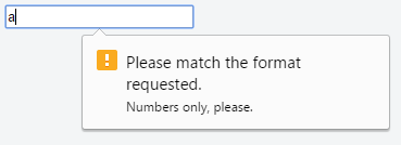
Not all browsers display a message for invalid patterns, although there is full support among most used modern browsers.
Check the latest support on CanIUse (opens new window) and implement accordingly.
# Accept File Type
For input fields of type file, it is possible to accept only certain types of files, such as videos, images, audios, specific file extensions, or certain media types (opens new window). For example:
<input type="file" accept="image/*" title="Only images are allowed">
Multiple values can be specified with a comma, e.g.:
<input type="file" accept="image/*,.rar,application/zip">
Note: Adding novalidate attribute to the form element or formnovalidate attribute to the submit button, prevents validation on form elements. For example:
<form>
    <input type="text" name="name" required>
    <input type="email" name="email" required>
    <input pattern="\d*" name="number" required>

    <input type="submit" value="Publish"> <!-- form will be validated -->
    <input type="submit" value="Save" formnovalidate> <!-- form will NOT be validated -->
</form>
The form has fields that are required for "publishing" the draft but aren’t required for "saving" the draft.
# Text
The most basic input type and the default input if no type is specified. This input type defines a single-line text field with line-breaks automatically removed from the input value. All other characters can be entered into this. <input> elements are used within a <form> element to declare input controls that allow users to input data.
Syntax
<input type="text">
or (without specifying a type, using the default attribute):
<input>
The default width of a text field input is 20 characters. This can be changed by specifying a value for the size attribute like this:
<input type="text" size="50">
The size attribute is distinctly different than setting a width with CSS. Using a width defines a specific value (in number of pixel, percentage of the parent element, etc.) that the input must always be wide. Using the size calculates the amount of width to allocate based on the font being used and how wide the characters normally are.
Note: Using the size attribute does not inherently limit the number of characters which can be entered into the box, only how wide the box is displayed. For limiting the length, see Input Validation (opens new window).
An input field only allows one line of text. If you need a multi-line text input for substantial amount of text, use a <textarea> element (opens new window) instead.
# Color
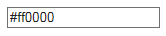
<input type="color" name="favcolor" value="#ff0000">
In supporting browsers, the input element with a type attribute whose value is color creates a button-like control, with a color equal to the value of color attribute (defaults to black if value is not specified or is an invalid hexadecimal format).

Clicking this button opens the operating system's color widget, which allows user to select a color.
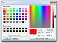
Fallback for browsers which do not support this input type is a regular input type=text (opens new window).
# Password
<input type="password" name="password">
The input element with a type attribute whose value is password creates a single-line text field similar to the input type=text (opens new window), except that text is not displayed as the user enters it.
<input type="password" name="password" placeholder="Password">
Placeholder text is shown in plain text and is overwritten automatically when a user starts typing.
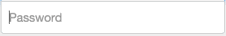
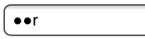
Note: Some browsers and systems modify the default behavior of the password field to also display the most recently typed character for a short duration, like so:
# File
<input type="file" name="fileSubmission">
File inputs allow users to select a file from their local filesystem for use with the current page. If used in conjunction with a form element, they can be used to allow users to upload files to a server (for more info see Uploading Files (opens new window)).
The following example allows users to use the file input to select a file from their filesystem and upload that file to a script on the server named upload_file.php.
<form action="upload_file.php" method="post" enctype="multipart/form-data">
    Select file to upload:
    <input type="file" name="fileSubmission" id="fileSubmission">
    <input type="submit" value="Upload your file" name="submit">
</form>
Multiple files
Adding the multiple attribute the user will be able to select more than one file:
<input type="file" name="fileSubmission" id="fileSubmission" multiple>
Accept Files
Accept attribute specifies the types of files that user can select. E.g. .png, .gif, .jpeg.
<input type="file" name="fileSubmission" accept="image/x-png,image/gif,image/jpeg" />
# Submit
<input type="submit" value="Submit">
A submit input creates a button which submits the form it is inside when clicked.
You can also use the <button> element if you require a submit button that can be more easily styled or contain other elements:
<button type="submit">
  <img src="submit-icon.jpg" /> Submit
</button>
# Reset
<input type="reset" value="Reset">
An input of type reset creates a button which, when clicked, resets all inputs in the form it is contained in to their default state.
- Text in an input field will be reset to blank or its default value (specified using the
valueattribute). - Any option(s) in a selection menu will be deselected unless they have the
selectedattribute. - All checkboxes and radio boxes will be deselected unless they have the
checkedattribute.
Note: A reset button must be inside or attached to (via the form attribute) a <form> element in order to have any effect. The button will only reset the elements within this form.
# Button
<input type="button" value="Button Text">
Buttons can be used for triggering actions to occur on the page, without submitting the form. You can also use the <button> element if you require a button that can be more easily styled or contain other elements:
<button type="button">Button Text</button>
Buttons are typically used with an "onclick" event:
<input type="button" onclick="alert('hello world!')" value="Click Me">
or
<button type="button" onclick="alert('hello world!')">Click Me</button>
# Attributes
# [name]
The name of the button, which is submitted with the form data.
# [type]
The type of the button.
Possible values are:
submit : The button submits the form data to the server. This is the default if the attribute is not specified, or if the attribute is dynamically changed to an empty or invalid value.
reset : The button resets all the controls to their initial values.
button : The button has no default behavior. It can have client-side scripts associated with the element's events, which are triggered when the events occur.
menu : The button opens a popup menu defined via its designated element.
# [value]
The initial value of the button.
# Extra Attributes for Submit Buttons
| Attribute | Description |
|---|---|
form | Specifies the ID of the form the button belongs to. If none is specified, it will belong to its ancestor form element (if one exists). |
formaction | Specifies where to send the form-data when the form is submitted using this button. |
formenctype | Specifies how the form-data should be encoded when submitting it to the server using this button. Can only be used with formmethod="post". |
formmethod | Specifies the HTTP method to use (POST or GET) when sending form-data using this button. |
formnovalidate | Specifies that the form-data should not be validated on submission. |
formtarget | Specifies where to display the response that is received after submitting the form using this button. |
# Hidden
<input type="hidden" name="inputName" value="inputValue">
A hidden input won't be visible to the user, but its value will be sent to the server when the form is submitted nonetheless.
# Tel
<input type="tel" value="+8400000000">
The input element with a type attribute whose value is tel represents a one-line plain-text edit control for entering a telephone number.
# Number
<input type="number" value="0" name="quantity">
The Input element with a type attribute whose value is number represents a precise control for setting the element’s value to a string representing a number.
Please note that this field does not guarantee to have a correct number. It just allows all the symbols which could be used in any real number, for example user will be able to enter value like e1e-,0.
The <input type="email"> is used for input fields that should contain an e-mail address.
<form>
  <label>E-mail: <label>
  <input type="email" name="email">
</form>
E-mail address can be automatically validated when submitted depending on browser support.
# Range
<input type="range" min="" max="" step="" />
A control for entering a number whose exact value is not important.
| Attribute | Description | Default value |
|---|---|---|
| min | Minimum value for range | 0 |
| max | Maximum value for range | 100 |
| step | Amount to increase by on each increment. | 1 |
# Image
<input type="image" src="img.png" alt="image_name" height="50px" width="50px"/>
An Image. You must use the src attribute to define the source of the image and the alt attribute to define alternative text. You can use the height and width attributes to define the size of the image in pixels.
# Week
<input type="week" />
Dependent on browser support, a control will show for entering a week-year number and a week number with no time zone.
# Search
Input type search is used for textual search. It will add magnifier symbol next to space for text on most browsers
<input type="search" name="googlesearch">
# Url
<input type="url" name="Homepage">
This is used for input fields that should contain a URL address.
Depending on browser support, the url field can be automatically validated when submitted.
Some smartphones recognize the url type, and adds ".com" to the keyboard to match url input.
# DateTime-Local
<input type="datetime-local" />
Dependent on browser support, a date and time picker will pop up on screen for you to choose a date and time.
# Month
<input type="month" />
Dependent on browser support, a control will show to pick the month.
# Time
<input type="time" />
The time input marks this element as accepting a string representing a time. The format is defined in RFC 3339 (opens new window) and should be a partial-time such as
19:04:39
08:20:39.04
Currently, all versions of Edge, Chrome, Opera, and Chrome for Android support type="time". The newer versions of Android Browser, specifically 4.4 and up support it. Safari for iOS offers partial support, not supporting min, max, and step attributes.
# Date
<input type="date" />
A date picker will pop up on screen for you to choose a date. This is not supported in Firefox or Internet Explorer.
# DateTime (Global)
The input element with a type attribute whose value is "datetime" represents a control for setting the element’s value to a string representing a global date and time (with timezone information).
<fieldset>
   <p><label>Meeting time: <input type=datetime name="meeting.start"></label>
</fieldset>
Permitted attributes:
- global attributes
- name
- disabled
- form
- type
- autocomplete
- autofocus
- list
- min & max
- step (float)
- readonly
- required value
# Syntax
<input type="" name="" value="">
# Parameters
| Parameter | Details |
|---|---|
| class | Indicates the Class of the input |
| id | Indicates the ID of the input |
| type | Identifies the type of input control to display. Acceptable values are hidden, text, tel, url, email, password, date, time, number, range, color, checkbox, radio, file, submit, image, reset, and button. Defaults to text if not specified, if the value is invalid, or if the browser does not support the type specified. |
| name | Indicates the name of the input |
| disabled | Boolean value that indicates the input should be disabled. Disabled controls cannot be edited, are not sent on form submission, and cannot receive focus. |
| checked | When the value of the type attribute is radio or checkbox, the presence of this Boolean attribute indicates that the control is selected by default; otherwise it is ignored. |
| multiple | HTML5 Indicates multiple files or values can be passed (Applies only to file and email type inputs ) |
| placeholder | HTML5 A hint to the user of what can be entered in the control . The placeholder text must not contain carriage returns or line-feeds |
| autocomplete | HTML5 Indicates whether the value of the control can be automatically completed by the browser. |
| readonly | Boolean value that indicates the input is not editable. Readonly controls are still sent on form submission, but will not receive focus. HTML5: This attribute is ignored when the value of type attribute is either set to hidden, range, color, checkbox, radio, file or button. |
| required | HTML5 Indicates a value must be present or the element must be checked in order for the form to be submitted |
| alt | An alternative text for images, in case they are not displayed. |
| autofocus | The <input> element should get the focus when page loads. |
| value | Specifies the value of <input> element. |
| step | The step attribute specifies the legal number intervals. It works with the following input types: number, range, date, datetime-local, month, time and week. |
# Remarks
As with other HTML5 void elements, <input> is self-closing and may be written <input />. HTML5 does not require this slash.
The following are valid input types in HTML:
button(opens new window)checkbox(opens new window)file(opens new window)hidden(opens new window)image(opens new window)password(opens new window)radio(opens new window)reset(opens new window)submit(opens new window)text(opens new window) (default value)
The following are newly introduced input types as a part of HTML 5 standard. Some of these types are not supported by all web browsers. In the case where a type is not supported, the input element will default to the text type.
color(opens new window)date(opens new window)datetime(Deprecated and Obsolete)datetime-local(opens new window)email(opens new window)month(opens new window)number(opens new window)range(opens new window)searchtel(opens new window)time(opens new window)url(opens new window)week(opens new window)
To check which browsers support which types, you can go to caniuse.com (opens new window).
← Image Maps Forms →