# Transitions
# Transition shorthand
CSS
div {
  width: 150px;
  height: 150px;
  background-color: red;
  transition: background-color 1s;
}
div:hover {
  background-color: green;
}
HTML
<div></div>
This example will change the background color when the div is hovered the background-color change will last 1 second.
# cubic-bezier
The cubic-bezier function is a transition timing function which is often used for custom and smooth transitions.
transition-timing-function: cubic-bezier(0.1, 0.7, 1.0, 0.1);
The function takes four parameters:
cubic-bezier(P1_x, P1_y, P2_x, P2_y)
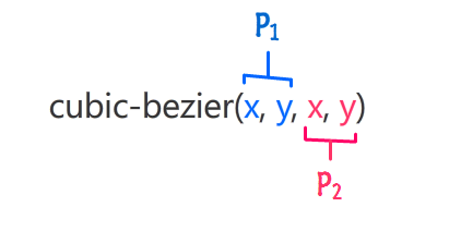
These parameters will be mapped to points which are part of a Bézier curve (opens new window):
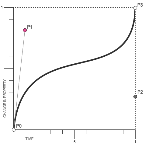
For CSS Bézier Curves, P0 and P3 are always in the same spot. P0 is at (0,0) and P3 is at (1,1), which menas that the parameters passed to the cubic-bezier function can only be between 0 and 1.
If you pass parameters which aren't in this interval the function will default to a linear transition.
Since cubic-bezier is the most flexible transition in CSS, you can translate all other transition timing function to cubic-bezier functions:
linear: cubic-bezier(0,0,1,1)
ease-in: cubic-bezier(0.42, 0.0, 1.0, 1.0)
ease-out: cubic-bezier(0.0, 0.0, 0.58, 1.0)
ease-in-out: cubic-bezier(0.42, 0.0, 0.58, 1.0)
# Transition (longhand)
# CSS
div {
  height: 100px;
  width: 100px;
  border: 1px solid;
  transition-property: height, width;
  transition-duration: 1s, 500ms;
  transition-timing-function: linear;
  transition-delay: 0s, 1s;
}
div:hover {
  height: 200px;
  width: 200px;
}
# HTML
<div></div>
- transition-property: Specifies the CSS properties the transition effect is for. In this case, the div will expand both horizontally and vertically when hovered.
- transition-duration: Specifies the length of time a transition takes to complete. In the above example, the height and width transitions will take 1 second and 500 milliseconds respectively.
- transition-timing-function: Specifies the speed curve of the transition effect. A linear value indicates the transition will have the same speed from start to finish.
- transition-delay: Specifies the amount of time needed to wait before the transition effect starts. In this case, the height will start transitioning immediately, whereas the width will wait 1 second.
# Syntax
- transition: [transition-property][transition-duration] [transition-timing-function][transition-delay];
# Parameters
| Parameter | Details |
|---|---|
| transition-property | The specific CSS property whose value change needs to be transitioned (or) all, if all the transitionable properties (opens new window) need to be transitioned. |
| transition-duration | The duration (or period) in seconds (s) or milliseconds (ms) over which the transition must take place. |
| transition-timing-function | A function that describes how the intermediate values during the transition are calculated. Commonly used values are ease, ease-in, ease-out, ease-in-out, linear, cubic-bezier(), steps(). More information about the various timing functions can be found in the W3C specs (opens new window). |
| transition-delay | The amount of time that must have elapsed before the transition can start. Can be specified in seconds (s) or milliseconds (ms) |
# Remarks
Some older browsers support only vendor-prefixed (opens new window) transition properties:
-webkit: Chrome 25-, Safari 6-, Safari & Chrome for iOS 6.1-, Android 4.3- Browser, Blackberry Browser 7-, UC Browser 9.9- for Android.-moz: Firefox 15-.-o: Opera 11.5-, Opera Mobile 12-.
Example:
-webkit-transition: all 1s;
-moz-transition: all 1s;
-o-transition: all 1s;
transition: all 1s;
← Tables Animations →