# Floats
# Float an Image Within Text
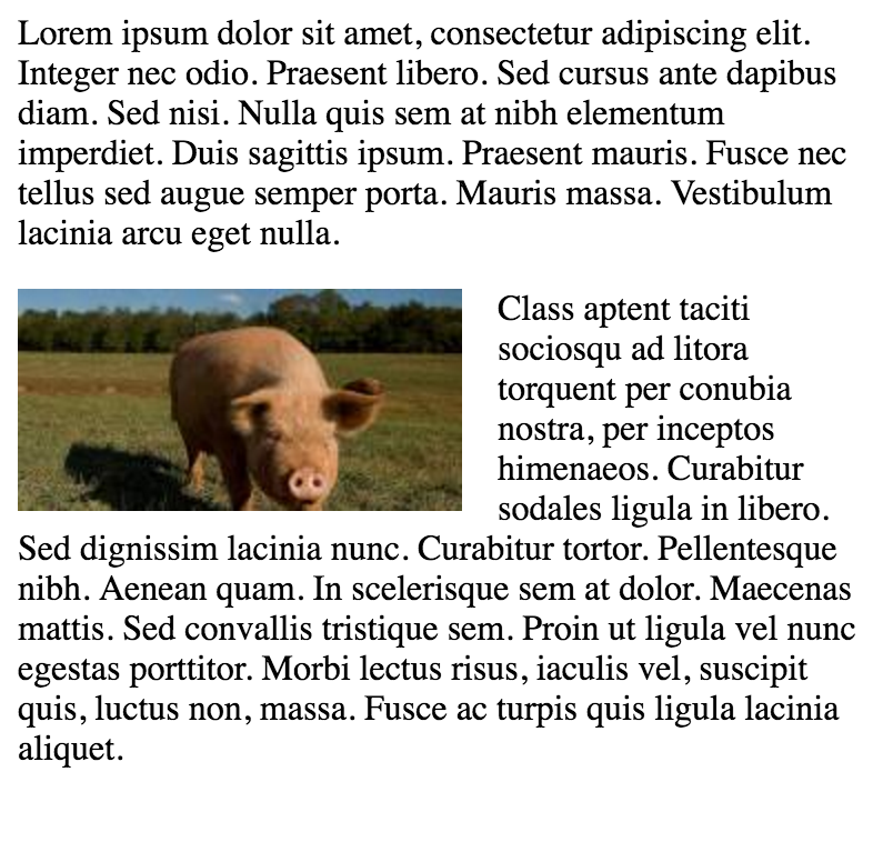
The most basic use of a float is having text wrap around an image. The below code will produce two paragraphs and an image, with the second paragraph flowing around the image. Notice that it is always content after the floated element that flows around the floated element.
HTML:
<p>Lorem ipsum dolor sit amet, consectetur adipiscing elit. Integer nec odio. Praesent libero. Sed cursus ante dapibus diam. Sed nisi. Nulla quis sem at nibh elementum imperdiet. Duis sagittis ipsum. Praesent mauris. Fusce nec tellus sed augue semper porta. Mauris massa. Vestibulum lacinia arcu eget nulla. </p>

<img src="http://lorempixel.com/200/100/" />

<p>Class aptent taciti sociosqu ad litora torquent per conubia nostra, per inceptos himenaeos. Curabitur sodales ligula in libero. Sed dignissim lacinia nunc. Curabitur tortor. Pellentesque nibh. Aenean quam. In scelerisque sem at dolor. Maecenas mattis. Sed convallis tristique sem. Proin ut ligula vel nunc egestas porttitor. Morbi lectus risus, iaculis vel, suscipit quis, luctus non, massa. Fusce ac turpis quis ligula lacinia aliquet. </p>
CSS:
img {
  float:left;
  margin-right:1rem;
}
This will be the output
 (opens new window)
Codepen Link (opens new window)
# clear property
The clear property is directly related to floats. Property Values:
- none - Default. Allows floating elements on both sides
- left - No floating elements allowed on the left side
- right - No floating elements allowed on the right side
- both - No floating elements allowed on either the left or the right side
- initial - Sets this property to its default value. Read about initial
- inherit - Inherits this property from its parent element. Read about inherit
<html>
<head>
<style>
img {
    float: left;
}

p.clear {
    clear: both;
}
</style>
</head>
<body>

<img src="https://static.pexels.com/photos/69372/pexels-photo-69372-medium.jpeg" width="100">
<p>Lorem ipsoum Lorem ipsoum Lorem ipsoum Lorem ipsoum Lorem ipsoum Lorem ipsoum Lorem ipsoum Lorem ipsoum Lorem ipsoum Lorem ipsoum Lorem ipsoum Lorem ipsoum </p>
<p class="clear">Lorem ipsoum Lorem ipsoum Lorem ipsoum Lorem ipsoum Lorem ipsoum Lorem ipsoum Lorem ipsoum Lorem ipsoum Lorem ipsoum Lorem ipsoum Lorem ipsoum Lorem ipsoum </p>

</body>
</html>
# Clearfix
The clearfix hack is a popular way to contain floats (N. Gallagher aka @necolas)
Not to be confused with the clear (opens new window) property, clearfix is a concept (that is also related to floats, thus the possible confusion). To contain floats, you've to add .cf or .clearfix class on the container (the parent) and style this class with a few rules described below.
3 versions with slightly different effects (sources :A new micro clearfix hack (opens new window) by N. Gallagher and clearfix reloaded (opens new window) by T. J. Koblentz):
# Clearfix (with top margin collapsing of contained floats still occurring)
.cf:after {
    content: "";
    display: table;
}

.cf:after {
    clear: both;
}
# Clearfix also preventing top margin collapsing of contained floats
/**
 * For modern browsers
 * 1. The space content is one way to avoid an Opera bug when the
 *    contenteditable attribute is included anywhere else in the document.
 *    Otherwise it causes space to appear at the top and bottom of elements
 *    that are clearfixed.
 * 2. The use of `table` rather than `block` is only necessary if using
 *    `:before` to contain the top-margins of child elements.
 */
.cf:before,
.cf:after {
    content: " "; /* 1 */
    display: table; /* 2 */
}

.cf:after {
    clear: both;
}
# Clearfix with support of outdated browsers IE6 and IE7
.cf:before,
.cf:after {
    content: " ";
    display: table;
}

.cf:after {
    clear: both;
}

/**
 * For IE 6/7 only
 * Include this rule to trigger hasLayout and contain floats.
 */
.cf {
    *zoom: 1;
}
Codepen showing clearfix effect (opens new window)
Other resource: Everything you know about clearfix is wrong (opens new window) (clearfix and BFC - Block Formatting Context while hasLayout relates to outdated browsers IE6 maybe 7)
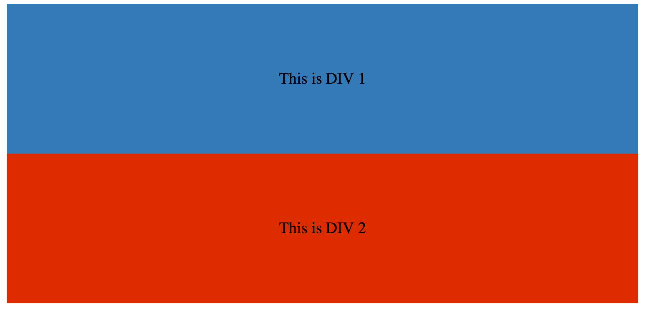
# In-line DIV using float
The div is a block-level element, i.e it occupies the whole of the page width and the siblings are place one below the other irrespective of their width.
<div>
    <p>This is DIV 1</p>
</div>
<div>
    <p>This is DIV 2</p>
</div>
The output of the following code will be
 (opens new window)
We can make them in-line by adding a float css property to the div.
HTML:
<div class="outer-div">
    <div class="inner-div1">
        <p>This is DIV 1</p>
    </div>
    <div class="inner-div2">
        <p>This is DIV 2</p>
    </div>
</div>
CSS
.inner-div1 {
    width: 50%;
    margin-right:0px;
    float:left;
    background : #337ab7;
    padding:50px 0px;
}

.inner-div2 {
    width: 50%;
    margin-right:0px;
    float:left;
    background : #dd2c00;
    padding:50px 0px;
}

p {
    text-align:center;
}

Codepen Link (opens new window)
# Simple Two Fixed-Width Column Layout
A simple two-column layout consists of two fixed-width, floated elements. Note that the sidebar and content area are not the same height in this example. This is one of the tricky parts with multi-column layouts using floats, and requires workarounds to make multiple columns appear to be the same height.
HTML:
<div class="wrapper">

<div class="sidebar">
  <h2>Sidebar</h2>

  <p>Lorem ipsum dolor sit amet, consectetur adipiscing elit. Integer nec odio.</p>
</div>

<div class="content">
  <h1>Content</h1>

  <p>Class aptent taciti sociosqu ad litora torquent per conubia nostra, per inceptos himenaeos. Curabitur sodales ligula in libero. Sed dignissim lacinia nunc. Curabitur tortor. Pellentesque nibh. Aenean quam. In scelerisque sem at dolor. Maecenas mattis. Sed convallis tristique sem. Proin ut ligula vel nunc egestas porttitor. Morbi lectus risus, iaculis vel, suscipit quis, luctus non, massa. Fusce ac turpis quis ligula lacinia aliquet. </p>
</div>

</div>
CSS:
.wrapper {
  width:600px;
  padding:20px;
  background-color:pink;

  /* Floated elements don't use any height. Adding "overflow:hidden;" forces the
     parent element to expand to contain its floated children. */
  overflow:hidden;
}

.sidebar {
  width:150px;
  float:left;
  background-color:blue;
}

.content {
  width:450px;
  float:right;
  background-color:yellow;
}
# Simple Three Fixed-Width Column Layout
HTML:
<div class="wrapper">
  <div class="left-sidebar">
    <h1>Left Sidebar</h1>
    <p>Lorem ipsum dolor sit amet, consectetur adipiscing elit. </p>
  </div>
  <div class="content">
    <h1>Content</h1>
    <p>Class aptent taciti sociosqu ad litora torquent per conubia nostra, per inceptos himenaeos. Curabitur sodales ligula in libero. Sed dignissim lacinia nunc. Curabitur tortor. Pellentesque nibh. Aenean quam. In scelerisque sem at dolor. Maecenas mattis. Sed convallis tristique sem. Proin ut ligula vel nunc egestas porttitor. Morbi lectus risus, iaculis vel, suscipit quis, luctus non, massa. </p>
  </div>
  <div class="right-sidebar">
    <h1>Right Sidebar</h1>
    <p>Fusce ac turpis quis ligula lacinia aliquet.</p>
  </div>
</div>
CSS:
.wrapper {
  width:600px;
  background-color:pink;
  padding:20px;

  /* Floated elements don't use any height. Adding "overflow:hidden;" forces the
     parent element to expand to contain its floated children. */
  overflow:hidden;
}

.left-sidebar {
  width:150px;
  background-color:blue;
  float:left;
}

.content {
  width:300px;
  background-color:yellow;
  float:left;
}

.right-sidebar {
  width:150px;
  background-color:green;
  float:right;
}
# Two-Column Lazy/Greedy Layout
This layout uses one floated column to create a two-column layout with no defined widths. In this example the left sidebar is "lazy," in that it only takes up as much space as it needs. Another way to say this is that the left sidebar is "shrink-wrapped." The right content column is "greedy," in that it takes up all the remaining space.
HTML:
<div class="sidebar">
<h1>Sidebar</h1>
<img src="http://lorempixel.com/150/200/" />
</div>

<div class="content">
<h1>Content</h1>
<p>Lorem ipsum dolor sit amet, consectetur adipiscing elit. Integer nec odio. Praesent libero. Sed cursus ante dapibus diam. Sed nisi. Nulla quis sem at nibh elementum imperdiet. Duis sagittis ipsum. Praesent mauris. Fusce nec tellus sed augue semper porta. Mauris massa. Vestibulum lacinia arcu eget nulla. </p>
<p>Class aptent taciti sociosqu ad litora torquent per conubia nostra, per inceptos himenaeos. Curabitur sodales ligula in libero. Sed dignissim lacinia nunc. Curabitur tortor. Pellentesque nibh. Aenean quam. In scelerisque sem at dolor. Maecenas mattis. Sed convallis tristique sem. Proin ut ligula vel nunc egestas porttitor. Morbi lectus risus, iaculis vel, suscipit quis, luctus non, massa. Fusce ac turpis quis ligula lacinia aliquet. Mauris ipsum. Nulla metus metus, ullamcorper vel, tincidunt sed, euismod in, nibh. </p>
</div>
CSS:
.sidebar {
  /* `display:table;` shrink-wraps the column */
  display:table;
  float:left;
  background-color:blue;
}

.content {
  /* `overflow:hidden;` prevents `.content` from flowing under `.sidebar` */
  overflow:hidden;
  background-color:yellow;
}
# Use of overflow property to clear floats
Setting overflow value to hidden,auto or scroll to an element, will clear all the floats within that element.
Note: using overflow:scroll will always show the scrollbox
# Syntax
- clear: none | left | right | both | inline-start | inline-end;
- float: left | right | none | inline-start | inline-end;
# Remarks
As float implies the use of the block layout, it modifies the computed value of the display values in some cases [1]
[1]: https://developer.mozilla.org/en-US/docs/Web/CSS/float (opens new window) MDN