# Clipping and Masking
# Simple mask that fades an image from solid to transparent
# CSS
div {
  height: 200px;
  width: 200px;
  background: url(http://lorempixel.com/200/200/nature/1);
  mask-image: linear-gradient(to right, white, transparent);
}
# HTML
<div></div>
In the above example there is an element with an image as its background. The mask that is applied on the image (using CSS) makes it look as though it is fading out from left to right.
The masking is achieved by using a linear-gradient that goes from white (on the left) to transparent (on the right) as the mask. As it is an alpha mask, image becomes transparent where the mask is transparent.
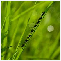
Output without the mask:
Output with the mask:
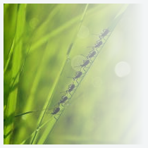
Note: As mentioned in remarks, the above example would work in Chrome, Safari and Opera only when used with the -webkit prefix. This example (with a linear-gradient as mask image) is not yet supported in Firefox.
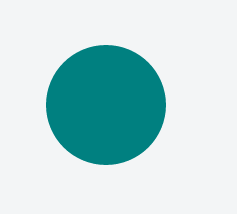
# Clipping (Circle)
# CSS:
div {
  width: 200px;
  height: 200px;
  background: teal;
  clip-path: circle(30% at 50% 50%); /* refer remarks before usage */
}
# HTML
<div></div>
This example shows how to clip a div to a circle. The element is clipped into a circle whose radius is 30% based on the dimensions of the reference box with its center point at the center of the reference box. Here since no border-box of the element will be used as the reference box.
The circle shape needs to have a radius and a center with (x,y) coordinates:
circle(radius at x y)
View Example (opens new window)
Output:
# Clipping and Masking: Overview and Difference
With Clipping and Masking you can make some specified parts of elements transparent or opaque. Both can be applied to any HTML element.
# Clipping
Clips are vector paths. Outside of this path the element will be transparent, inside it's opaque. Therefore you can define a clip-path property on elements. Every graphical element that also exists in SVG you can use here as a function to define the path. Examples are circle(), polygon() or ellipse().
clip-path: circle(100px at center);
The element will be only visible inside of this circle, which is positioned at the center of the element and has a radius of 100px.
# Masking
Masks are similar to Clips, but instead of defining a path you define a mask what layers over the element. You can imagine this mask as an image what consist of mainly two colors: black and white.
Luminance Mask: Black means the region is opaque, and white that it's transparent, but there is also a grey area which is semi-transparent, so you are able to make smooth transitions.
Alpha Mask: Only on the transparent areas of the mask the element will be opaque.
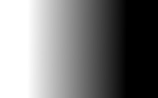
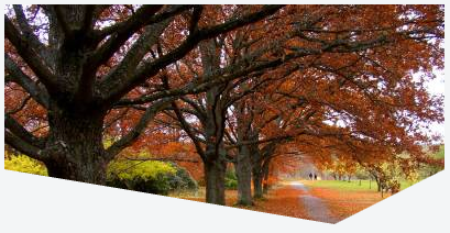
This image for example can be used as a luminance mask to make for an element a very smooth transition from right to left and from opaque to transparent.
The mask property let you specify the the mask type and an image to be used as layer.
mask: url(masks.svg#rectangle) luminance;
An element called rectangle defined in masks.svg will be used as an luminance mask on the element.
# Clipping (Polygon)
# CSS:
div {
  width: 200px;
  height: 200px;
  background: teal;
  clip-path: polygon(0 0, 0 100%, 100% 50%); /* refer remarks before usage */
}
# HTML:
<div></div>
In the above example, a polygonal clipping path is used to clip the square (200 x 200) element into a triangle shape. The output shape is a triangle because the path starts at (that is, first coordinates are at) 0 0 - which is the top-left corner of the box, then goes to 0 100% - which is bottom-left corner of the box and then finally to 100% 50% which is nothing but the right-middle point of the box. These paths are self closing (that is, the starting point will be the ending point) and so the final shape is that of a triangle.
This can also be used on an element with an image or a gradient as background.
View Example (opens new window)
Output:

# Using masks to cut a hole in the middle of an image
# CSS
div {
  width: 200px;
  height: 200px;
  background: url(http://lorempixel.com/200/200/abstract/6);
  mask-image: radial-gradient(
    circle farthest-side at center,
    transparent 49%,
    white 50%
  ); /* check remarks before using */
}
# HTML
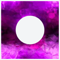
In the above example, a transparent circle is created at the center using radial-gradient and this is then used as a mask to produce the effect of a circle being cut out from the center of an image.
Image without mask:
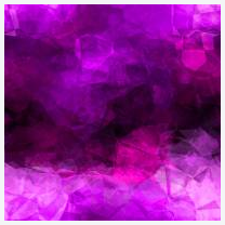
Image with mask:
# Using masks to create images with irregular shapes
# CSS
div {
  /* check remarks before usage */
  height: 200px;
  width: 400px;
  background-image: url(http://lorempixel.com/400/200/nature/4);
  mask-image: linear-gradient(to top right, transparent 49.5%, white 50.5%),
    linear-gradient(to top left, transparent 49.5%, white 50.5%),
    linear-gradient(white, white);
  mask-size: 75% 25%, 25% 25%, 100% 75%;
  mask-position: bottom left, bottom right, top left;
  mask-repeat: no-repeat;
}
# HTML
<div></div>
In the above example, three linear-gradient images (which when placed in their appropriate positions would cover 100% x 100% of the container's size) are used as masks to produce a transparent triangular shaped cut at the bottom of the image.
Image without the mask:
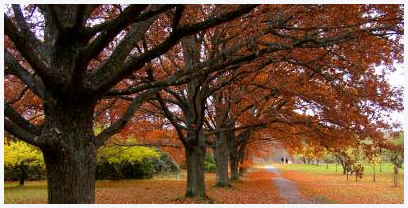
Image with the mask:
# Syntax
- Clipping
- clip-path:
| [ || ] | none - Masking
- mask-image: [ none |
]# - mask-mode: [
]# - mask-repeat: [ <repeat-style ]#
- mask-position: [
]# - mask-clip: [
| no-clip ]# - mask-origin: [
]# - mask-size: [
]# - mask-composite: [
]# - mask: [
? || [ / ]? || || || [ | no-clip ] || ]# - mask: [
# Parameters
| Parameter | Details |
|---|---|
| clip-source | A URL which can point to an inline SVG element (or) an SVG element in an external file that contains the clip path's definition. |
| basic-shape | Refers to one among inset(), circle(), ellipse() or polygon(). Using one of these functions the clipping path is defined. These shape functions work exactly the same way as they do in Shapes for Floats (opens new window) |
| clip-geometry-box | This can have one among content-box, padding-box, border-box, margin-box, fill-box, stroke-box, view-box as values. When this is provided without any value for |
| mask-reference | This can be none or an image or a reference URL to a mask image source. |
| repeat-style | This specifies how the mask should be repeated or tiled in the X and Y axes. The supported values are repeat-x, repeat-y, repeat, space, round, no-repeat. |
| mask-mode | Can be alpha or luminance or auto and indicates whether the mask should be treated as a alpha mask or a luminance mask. If no value is provided and the mask-reference is a direct image then it would be considered as alpha mask (or) if the mask-reference is a URL then it would be considered as luminance mask. |
| position | This specifies the position of each mask layer and is similar in behavior to the background-position property. The value can be provided in 1 value syntax (like top, 10%) or in 2 value syntax (like top right, 50% 50%). |
| geometry-box | This specifies the box to which the mask should be clipped (mask painting area) or the box which should be used as reference for the mask's origin (mask positioning area) depending on the property. The list of possible values are content-box, padding-box, border-box, margin-box, fill-box, stroke-box, view-box. Detailed explanation of how each of those values work is available in the W3C Spec (opens new window). |
| bg-size | This represents the size of each mask-image layer and has the same syntax as background-size. The value can be length or percentage or auto or cover or contain. Length, percentage and auto can either be provided as a single value or as one for each axis. |
| compositing-operator | This can be any one among add, subtract, exclude, multiply per layer and defines the type of compositing operation that should be used for this layer with those below it. Detailed explanation about each value is available in the W3C Specs (opens new window). |
# Remarks
CSS Clipping and Masking are very new concepts and so the browser support for these properties are pretty low.
# Masks:
As at the time of writing (Jul '16), Chrome, Safari and Opera support these properties with the -webkit- prefix.
Firefox doesn't require prefixes but it supports masks only when used with SVG mask elements. For inline SVG mask elements, the syntax is mask: url(#msk) whereas for using mask elements in an external SVG file the syntax is mask: url('yourfilepath/yourfilename.svg#msk'). #msk in both cases refers to the id of the mask element that is being referred to. As indicated in this answer (opens new window), at present Firefox doesn't support any parameter other than mask-reference in the mask property.
Internet Explorer (and Edge) does not offer any support for this property as yet.
The mask-mode property is currently not supported by any browser with or without prefixes.
# Clip-path:
As at the time writing (Jul '16) Chrome, Safari and Opera supports clip-path when the path is created using basic shapes (like circle, polygon) or the url(#clipper) syntax with inline SVG. They don't support clipping based on shapes that are part of external SVG files. Also, they require the -webkit prefix to be present.
Firefox supports only the url() syntax for clip-path whereas Internet Explorer (and Edge) offer no support.