# Overflow
# overflow-wrap
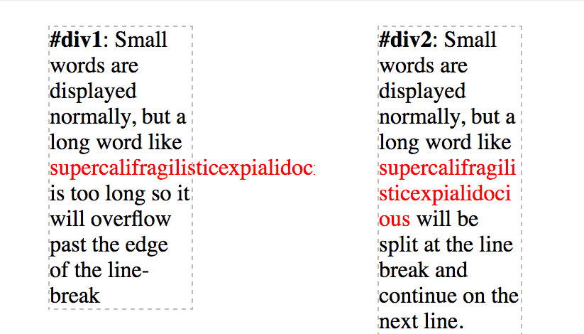
overflow-wrap tells a browser that it can break a line of text inside a targeted element onto multiple lines in an otherwise unbreakable place. Helpful in preventing an long string of text causing layout problems due to overflowing it's container.
CSS
div {
  width: 100px;
  outline: 1px dashed #bbb;
}

#div1 {
  overflow-wrap: normal;
}

#div2 {
  overflow-wrap: break-word;
}
HTML
<div id="div1">
  <strong>#div1</strong>: Small words are displayed normally, but a long word
  like <span style="red;">supercalifragilisticexpialidocious</span> is too long
  so it will overflow past the edge of the line-break
</div>

<div id="div2">
  <strong>#div2</strong>: Small words are displayed normally, but a long word
  like <span style="red;">supercalifragilisticexpialidocious</span> will be
  split at the line break and continue on the next line.
</div>
overflow-wrap – Value | Details |
|---|---|
normal | Lets a word overflow if it is longer than the line |
break-word | Will split a word into multiple lines, if necessary |
inherit | Inherits the parent element's value for this property |
# overflow: scroll
HTML
<div>
  This div is too small to display its contents to display the effects of the
  overflow property.
</div>
CSS
div {
  width: 100px;
  height: 100px;
  overflow: scroll;
}
Result
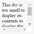
The content above is clipped in a 100px by 100px box, with scrolling available to view overflowing content.
Most desktop browsers will display both horizontal and vertical scrollbars, whether or not any content is clipped. This can avoid problems with scrollbars appearing and disappearing in a dynamic environment. Printers may print overflowing content.
# overflow: visible
HTML
<div>
  Even if this div is too small to display its contents, the content is not
  clipped.
</div>
CSS
div {
  width: 50px;
  height: 50px;
  overflow: visible;
}
Result
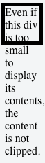
Content is not clipped and will be rendered outside the content box if it exceeds its container size.
# Block Formatting Context Created with Overflow
Using the overflow property with a value different to visible will create a new block formatting context. This is useful for aligning a block element next to a floated element.
CSS
img {
  float: left;
  margin-right: 10px;
}
div {
  overflow: hidden; /* creates block formatting context */
}
HTML
<img src="http://placehold.it/100x100" />
<div>
  <p>Lorem ipsum dolor sit amet, cum no paulo mollis pertinacia.</p>
  <p>
    Ad case omnis nam, mutat deseruisse persequeris eos ad, in tollit debitis
    sea.
  </p>
</div>
Result
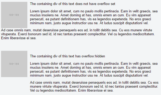
This example shows how paragraphs within a div with the overflow property set will interact with a floated image.
# overflow-x and overflow-y
These two properties work in a similar fashion as the overflow property and accept the same values. The overflow-x parameter works only on the x or left-to-right axis. The overflow-y works on the y or top-to-bottom axis.
HTML
<div id="div-x">
  If this div is too small to display its contents, the content to the left and
  right will be clipped.
</div>

<div id="div-y">
  If this div is too small to display its contents, the content to the top and
  bottom will be clipped.
</div>
CSS
div {
  width: 200px;
  height: 200px;
}

#div-x {
  overflow-x: hidden;
}

#div-y {
  overflow-y: hidden;
}
# Syntax
- overflow: visible | hidden | scroll | auto | initial | inherit;
# Parameters
Overflow Value | Details |
|---|---|
visible | Shows all overflowing content outside the element |
scroll | Hides the overflowing content and adds a scroll bar |
hidden | Hides the overflowing content, both scroll bars disappear and the page becomes fixed |
auto | Same as scroll if content overflows, but doesn't add scroll bar if content fits |
inherit | Inherit's the parent element's value for this property |
# Remarks
When an element is too small to display it's contents, what happens? By default, the content will just overflow and display outside the element. That makes your work look bad. You want your work to look good, so you set the overflow property to handle the overflowing content in a desirable way.
Values for the overflow property are identical to those for the overflow-x and overflow-y properties, exept that they apply along each axis
The overflow-wrap property has also been known as the word-wrap property.
Important note: Using the overflow property with a value different to visible will create a new block formatting context.