# box-shadow
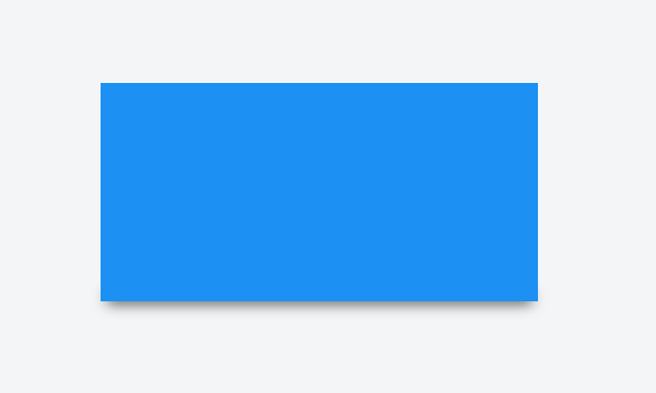
# bottom-only drop shadow using a pseudo-element
JSFiddle: https://jsfiddle.net/UnsungHero97/80qod7aL/2/ (opens new window)
HTML
<div class="box_shadow"></div>
CSS
.box_shadow {
  background-color: #1c90f3;
  width: 200px;
  height: 100px;
  margin: 50px;
}

.box_shadow:after {
  content: "";
  width: 190px;
  height: 1px;
  margin-top: 98px;
  margin-left: 5px;
  display: block;
  position: absolute;
  z-index: -1;
  -webkit-box-shadow: 0px 0px 8px 2px #444444;
  -moz-box-shadow: 0px 0px 8px 2px #444444;
  box-shadow: 0px 0px 8px 2px #444444;
}
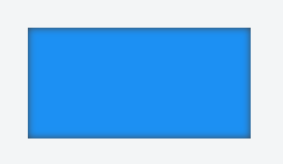
# drop shadow
JSFiddle: https://jsfiddle.net/UnsungHero97/80qod7aL/ (opens new window)
HTML
<div class="box_shadow"></div>
CSS
.box_shadow {
  -webkit-box-shadow: 0px 0px 10px -1px #444444;
  -moz-box-shadow: 0px 0px 10px -1px #444444;
  box-shadow: 0px 0px 10px -1px #444444;
}
# inner drop shadow
HTML
<div class="box_shadow"></div>
CSS
.box_shadow {
  background-color: #1c90f3;
  width: 200px;
  height: 100px;
  margin: 50px;
  -webkit-box-shadow: inset 0px 0px 10px 0px #444444;
  -moz-box-shadow: inset 0px 0px 10px 0px #444444;
  box-shadow: inset 0px 0px 10px 0px #444444;
}
Result:
JSFiddle: https://jsfiddle.net/UnsungHero97/80qod7aL/1/ (opens new window)
# multiple shadows
JSFiddle: https://jsfiddle.net/UnsungHero97/80qod7aL/5/ (opens new window)
HTML
<div class="box_shadow"></div>
CSS
.box_shadow {
  width: 100px;
  height: 100px;
  margin: 100px;
  box-shadow: -52px -52px 0px 0px #f65314, 52px -52px 0px 0px #7cbb00,
    -52px 52px 0px 0px #00a1f1, 52px 52px 0px 0px #ffbb00;
}

# Syntax
# Parameters
| Parameters | Details |
|---|---|
| inset | by default, the shadow is treated as a drop shadow. the inset keyword draws the shadow inside the frame/border. |
| offset-x | the horizontal distance |
| offset-y | the vertical distance |
| blur-radius | 0 by default. value cannot be negative. the bigger the value, the bigger and lighter the shadow becomes. |
| spread-radius | 0 by default. positive values will cause the shadow to expand. negative values will cause the shadow to shrink. |
| color | can be of various notations: a color keyword, hexadecimal, rgb(), rgba(), hsl(), hsla() |
# Remarks
Browser Support:
- Chrome 10.0
- IE 9.0
- Firefox 4.0 3.5 -moz
- Safari 5.1 3.1 -webkit-
- Opera 10.5