# Xamarin Forms Layouts
# AbsoluteLayout
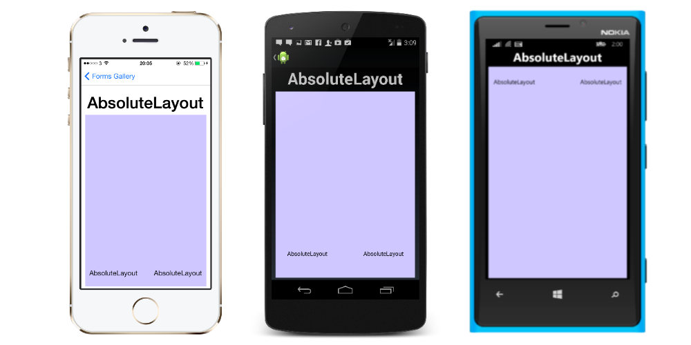
AbsoluteLayout positions and sizes child elements proportional to its own size and position or by absolute values. Child views may be positioned and sized using proportional values or static values, and proportional and static values can be mixed.
A definition of an AbsoluteLayout in XAML looks like this:
<AbsoluteLayout>
    <Label Text="I'm centered on iPhone 4 but no other device"
        AbsoluteLayout.LayoutBounds="115,150,100,100" LineBreakMode="WordWrap"  />
    <Label Text="I'm bottom center on every device."
        AbsoluteLayout.LayoutBounds=".5,1,.5,.1" AbsoluteLayout.LayoutFlags="All"
        LineBreakMode="WordWrap"  />
    <BoxView Color="Olive"  AbsoluteLayout.LayoutBounds="1,.5, 25, 100"
        AbsoluteLayout.LayoutFlags="PositionProportional" />
    <BoxView Color="Red" AbsoluteLayout.LayoutBounds="0,.5,25,100"
        AbsoluteLayout.LayoutFlags="PositionProportional" />
    <BoxView Color="Blue" AbsoluteLayout.LayoutBounds=".5,0,100,25"
        AbsoluteLayout.LayoutFlags="PositionProportional" />
    <BoxView Color="Blue" AbsoluteLayout.LayoutBounds=".5,0,1,25"
        AbsoluteLayout.LayoutFlags="PositionProportional, WidthProportional" />
</AbsoluteLayout>
The same layout would look like this in code:
Title = "Absolute Layout Exploration - Code";
var layout = new AbsoluteLayout();

var centerLabel = new Label {
Text = "I'm centered on iPhone 4 but no other device.",
LineBreakMode = LineBreakMode.WordWrap};

AbsoluteLayout.SetLayoutBounds (centerLabel, new Rectangle (115, 159, 100, 100));
// No need to set layout flags, absolute positioning is the default

var bottomLabel = new Label { Text = "I'm bottom center on every device.", LineBreakMode = LineBreakMode.WordWrap };
AbsoluteLayout.SetLayoutBounds (bottomLabel, new Rectangle (.5, 1, .5, .1));
AbsoluteLayout.SetLayoutFlags (bottomLabel, AbsoluteLayoutFlags.All);

var rightBox = new BoxView{ Color = Color.Olive };
AbsoluteLayout.SetLayoutBounds (rightBox, new Rectangle (1, .5, 25, 100));
AbsoluteLayout.SetLayoutFlags (rightBox, AbsoluteLayoutFlags.PositionProportional);

var leftBox = new BoxView{ Color = Color.Red };
AbsoluteLayout.SetLayoutBounds (leftBox, new Rectangle (0, .5, 25, 100));
AbsoluteLayout.SetLayoutFlags (leftBox, AbsoluteLayoutFlags.PositionProportional);

var topBox = new BoxView{ Color = Color.Blue };
AbsoluteLayout.SetLayoutBounds (topBox, new Rectangle (.5, 0, 100, 25));
AbsoluteLayout.SetLayoutFlags (topBox, AbsoluteLayoutFlags.PositionProportional);

var twoFlagsBox = new BoxView{ Color = Color.Blue };
AbsoluteLayout.SetLayoutBounds (topBox, new Rectangle (.5, 0, 1, 25));
AbsoluteLayout.SetLayoutFlags (topBox, AbsoluteLayoutFlags.PositionProportional | AbsoluteLayout.WidthProportional);

layout.Children.Add (bottomLabel);
layout.Children.Add (centerLabel);
layout.Children.Add (rightBox);
layout.Children.Add (leftBox);
layout.Children.Add (topBox);
The AbsoluteLayout control in Xamarin.Forms allows you to specify where exactly on the screen you want the child elements to appear, as well as their size and shape (bounds).
There are a few different ways to set the bounds of the child elements based on the AbsoluteLayoutFlags enumeration that are used during this process. The AbsoluteLayoutFlags enumeration contains the following values:
- All: All dimensions are proportional.
- HeightProportional: Height is proportional to the layout.
- None: No interpretation is done.
- PositionProportional: Combines XProportional and YProportional.
- SizeProportional: Combines WidthProportional and HeightProportional.
- WidthProportional: Width is proportional to the layout.
- XProportional: X property is proportional to the layout.
- YProportional: Y property is proportional to the layout.
The process of working with the layout of the AbsoluteLayout container may seem a little counterintuitive at first, but with a little use it will become familiar. Once you have created your child elements, to set them at an absolute position within the container you will need to follow three steps. You will want to set the flags assigned to the elements using the AbsoluteLayout.SetLayoutFlags() method. You will also want to use the AbsoluteLayout.SetLayoutBounds() method to give the elements their bounds. Finally, you will want to add the child elements to the Children collection. Since Xamarin.Forms is an abstraction layer between Xamarin and the device-specific implementations, the positional values can be independent of the device pixels. This is where the layout flags mentioned previously come into play. You can choose how the layout process of the Xamarin.Forms controls should interpret the values you define.
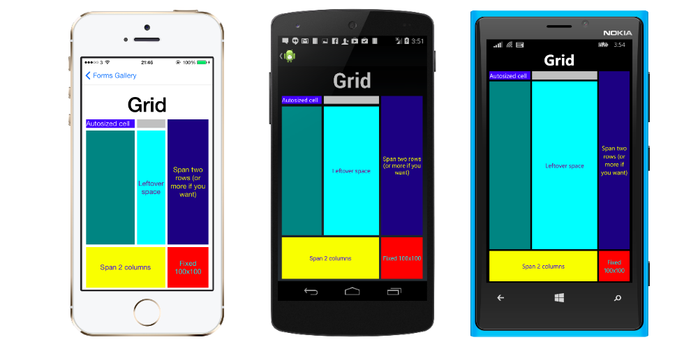
# Grid
A layout containing views arranged in rows and columns.
This is a typical Grid definition in XAML.
<Grid>
  <Grid.RowDefinitions>
    <RowDefinition Height="2*" />
    <RowDefinition Height="*" />
    <RowDefinition Height="200" />
  </Grid.RowDefinitions>
  <Grid.ColumnDefinitions>
    <ColumnDefinition Width="Auto" />
    <ColumnDefinition Width="*" />
  </Grid.ColumnDefinitions>

  <ContentView Grid.Row="0" Grid.Column="0"/>
  <ContentView Grid.Row="1" Grid.Column="0"/>
  <ContentView Grid.Row="2" Grid.Column="0"/>

  <ContentView Grid.Row="0" Grid.Column="1"/>
  <ContentView Grid.Row="1" Grid.Column="1"/>
  <ContentView Grid.Row="2" Grid.Column="1"/>

</Grid>
The same Grid defined in code looks like this:
var grid = new Grid();
grid.RowDefinitions.Add (new RowDefinition { Height = new GridLength(2, GridUnitType.Star) });
grid.RowDefinitions.Add (new RowDefinition { Height = new GridLength (1, GridUnitType.Star) });
grid.RowDefinitions.Add (new RowDefinition { Height = new GridLength(200)});
grid.ColumnDefinitions.Add (new ColumnDefinition{ Width = new GridLength (200) });
To add items to the grid:
In XAML:
<Grid>

   <--DEFINITIONS...--!>

   <ContentView Grid.Row="0" Grid.Column="0"/>
   <ContentView Grid.Row="1" Grid.Column="0"/>
   <ContentView Grid.Row="2" Grid.Column="0"/>

   <ContentView Grid.Row="0" Grid.Column="1"/>
   <ContentView Grid.Row="1" Grid.Column="1"/>
   <ContentView Grid.Row="2" Grid.Column="1"/>

</Grid>
In C# code:
var grid = new Grid();
//DEFINITIONS...
var topLeft = new Label { Text = "Top Left" };
var topRight = new Label { Text = "Top Right" };
var bottomLeft = new Label { Text = "Bottom Left" };
var bottomRight = new Label { Text = "Bottom Right" };
grid.Children.Add(topLeft, 0, 0);
grid.Children.Add(topRight, 0, 1);
grid.Children.Add(bottomLeft, 1, 0);
grid.Children.Add(bottomRight, 1, 1);
For Height and Width a number of units are available.
- Auto – automatically sizes to fit content in the row or column. Specified as GridUnitType.Auto in C# or as Auto in XAML.
- Proportional – sizes columns and rows as a proportion of the remaining space. Specified as a value and GridUnitType.Star in C# and as #* in XAML, with # being your desired value. Specifying one row/column with * will cause it to fill the available space.
- Absolute – sizes columns and rows with specific, fixed height and width values. Specified as a value and GridUnitType.Absolute in C# and as # in XAML, with # being your desired value.
Note: The width values for columns are set as Auto by default in Xamarin.Forms, which means that the width is determined from the size of the children. Note that this differs from the implementation of XAML on Microsoft platforms, where the default width is *, which will fill the available space.
# ContentPresenter
A layout manager for templated views. Used within a ControlTemplate to mark where the content to be presented appears.
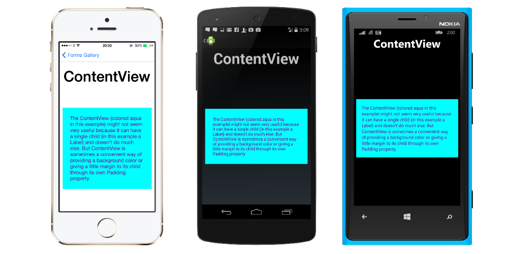
# ContentView
An element with a single content. ContentView has very little use of its own. Its purpose is to serve as a base class for user-defined compound views.
XAML
<ContentView>
<Label Text="Hi, I'm a simple Label inside of a simple ContentView"
HorizontalOptions="Center"
VerticalOptions="Center"/>
</ContentView>
Code
var contentView = new ContentView {
Content = new Label {
 Text = "Hi, I'm a simple Label inside of a simple ContentView",
 HorizontalOptions = LayoutOptions.Center,
 VerticalOptions = LayoutOptions.Center
}
};
# ScrollView
An element capable of scrolling if it's Content requires.
ScrollView contains layouts and enables them to scroll offscreen. ScrollView is also used to allow views to automatically move to the visible portion of the screen when the keyboard is showing.
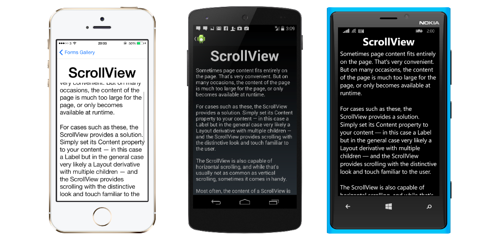
Note: ScrollViews should not be nested. In addition, ScrollViews should not be nested with other controls that provide scrolling, like ListView and WebView.
A ScrollView is easy to define. In XAML:
<ContentPage.Content>
    <ScrollView>
        <StackLayout>
            <BoxView BackgroundColor="Red" HeightRequest="600" WidthRequest="150" />
            <Entry />
        </StackLayout>
    </ScrollView>
</ContentPage.Content>
The same definition in code:
var scroll = new ScrollView();
Content = scroll;
var stack = new StackLayout();
stack.Children.Add(new BoxView { BackgroundColor = Color.Red,   HeightRequest = 600, WidthRequest = 600 });
stack.Children.Add(new Entry());
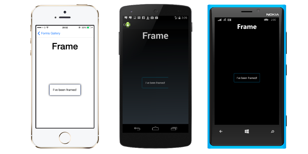
# Frame
An element containing a single child, with some framing options. Frame have a default Xamarin.Forms.Layout.Padding of 20.
XAML
<Frame>
<Label Text="I've been framed!"
HorizontalOptions="Center"
VerticalOptions="Center" />
</Frame>
Code
var frameView = new Frame {
Content = new Label {
 Text = "I've been framed!",
HorizontalOptions = LayoutOptions.Center,
VerticalOptions = LayoutOptions.Center
},
OutlineColor = Color.Red
};
# TemplatedView
An element that displays content with a control template, and the base class for ContentView.
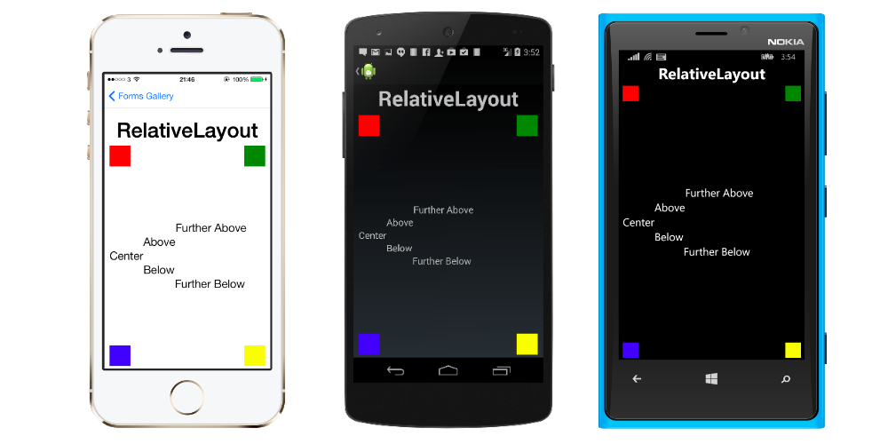
# RelativeLayout
A Layout that uses Constraints to layout its children.
RelativeLayout is used to position and size views relative to properties of the layout or sibling views. Unlike AbsoluteLayout, RelativeLayout does not have the concept of the moving anchor and does not have facilities for positioning elements relative to the bottom or right edges of the layout. RelativeLayout does support positioning elements outside of its own bounds.
A RelativeLayout in XAML, is like this:
<RelativeLayout>
    <BoxView Color="Red" x:Name="redBox"
        RelativeLayout.YConstraint="{ConstraintExpression Type=RelativeToParent,
            Property=Height,Factor=.15,Constant=0}"
        RelativeLayout.WidthConstraint="{ConstraintExpression
            Type=RelativeToParent,Property=Width,Factor=1,Constant=0}"
        RelativeLayout.HeightConstraint="{ConstraintExpression
            Type=RelativeToParent,Property=Height,Factor=.8,Constant=0}" />
    <BoxView Color="Blue"
        RelativeLayout.YConstraint="{ConstraintExpression Type=RelativeToView,
            ElementName=redBox,Property=Y,Factor=1,Constant=20}"
        RelativeLayout.XConstraint="{ConstraintExpression Type=RelativeToView,
            ElementName=redBox,Property=X,Factor=1,Constant=20}"
        RelativeLayout.WidthConstraint="{ConstraintExpression
            Type=RelativeToParent,Property=Width,Factor=.5,Constant=0}"
        RelativeLayout.HeightConstraint="{ConstraintExpression
            Type=RelativeToParent,Property=Height,Factor=.5,Constant=0}" />
</RelativeLayout>
The same layout can be accomplished with this code:
layout.Children.Add (redBox, Constraint.RelativeToParent ((parent) => {
        return parent.X;
    }), Constraint.RelativeToParent ((parent) => {
        return parent.Y * .15;
    }), Constraint.RelativeToParent((parent) => {
        return parent.Width;
    }), Constraint.RelativeToParent((parent) => {
        return parent.Height * .8;
    }));
layout.Children.Add (blueBox, Constraint.RelativeToView (redBox, (Parent, sibling) => {
        return sibling.X + 20;
    }), Constraint.RelativeToView (blueBox, (parent, sibling) => {
        return sibling.Y + 20;
    }), Constraint.RelativeToParent((parent) => {
        return parent.Width * .5;
    }), Constraint.RelativeToParent((parent) => {
        return parent.Height * .5;
    }));
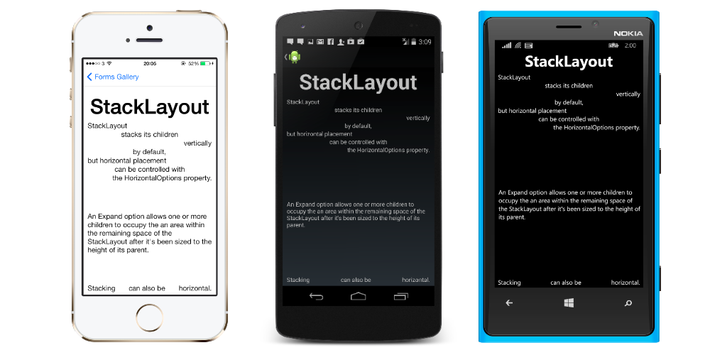
# StackLayout
StackLayout organizes views in a one-dimensional line ("stack"), either horizontally or vertically. Views in a StackLayout can be sized based on the space in the layout using layout options. Positioning is determined by the order views were added to the layout and the layout options of the views.
# Usage in XAML
<StackLayout>
    <Label Text="This will be on top" />
    <Button Text="This will be on the bottom" />
</StackLayout>
# Usage in code
StackLayout stackLayout = new StackLayout
{
    Spacing = 0,
    VerticalOptions = LayoutOptions.FillAndExpand,
    Children =
    {
        new Label
        {
            Text = "StackLayout",
            HorizontalOptions = LayoutOptions.Start
        },
        new Label
        {
            Text = "stacks its children",
            HorizontalOptions = LayoutOptions.Center
        },
        new Label
        {
            Text = "vertically",
            HorizontalOptions = LayoutOptions.End
        },
        new Label
        {
            Text = "by default,",
            HorizontalOptions = LayoutOptions.Center
        },
        new Label
        {
            Text = "but horizontal placement",
            HorizontalOptions = LayoutOptions.Start
        },
        new Label
        {
            Text = "can be controlled with",
            HorizontalOptions = LayoutOptions.Center
        },
        new Label
        {
            Text = "the HorizontalOptions property.",
            HorizontalOptions = LayoutOptions.End
        },
        new Label
        {
            Text = "An Expand option allows one or more children " +
                   "to occupy the an area within the remaining " +
                   "space of the StackLayout after it's been sized " +
                   "to the height of its parent.",
            VerticalOptions = LayoutOptions.CenterAndExpand,
            HorizontalOptions = LayoutOptions.End
        },
        new StackLayout
        {
            Spacing = 0,
            Orientation = StackOrientation.Horizontal,
            Children =
            {
                new Label
                {
                    Text = "Stacking",
                },
                new Label
                {
                    Text = "can also be",
                    HorizontalOptions = LayoutOptions.CenterAndExpand
                },
                new Label
                {
                    Text = "horizontal.",
                },
            }
        }
    }
};